2026
VOLTEN
Energy, turned up.
Food & Beverages
Brand Strategy
Creative Direction

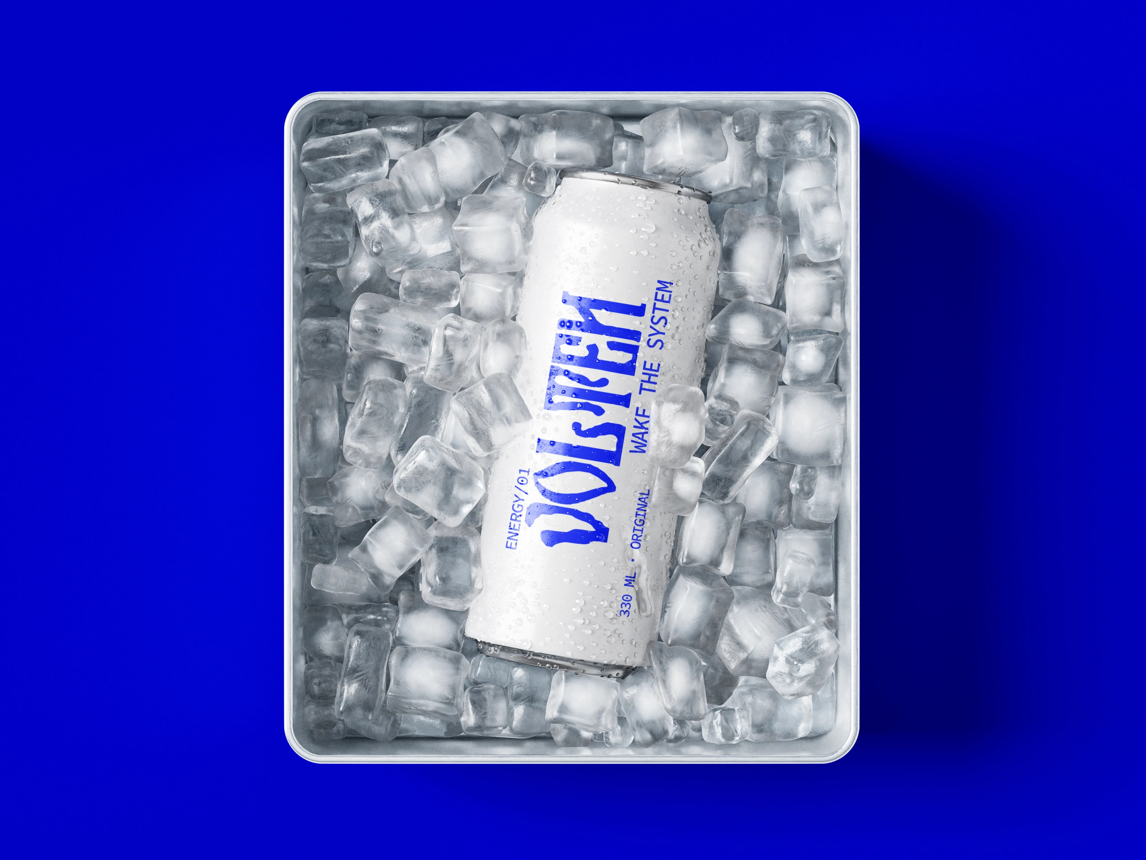
Volten is a new-generation energy drink built for people who move fast, think fast, and don't particularly care for the expected. The brand needed an identity with enough energy to stand out on shelf while remaining distinctive across digital and campaign environments.
[The_Challenge]
The energy drink category is crowded with aggressive graphics, predictable lightning bolts, and oversized claims. Volten needed to enter the space without becoming another version of the same visual formula.
The challenge was to create a brand that felt energetic without relying on visual noise.

[our_approach]
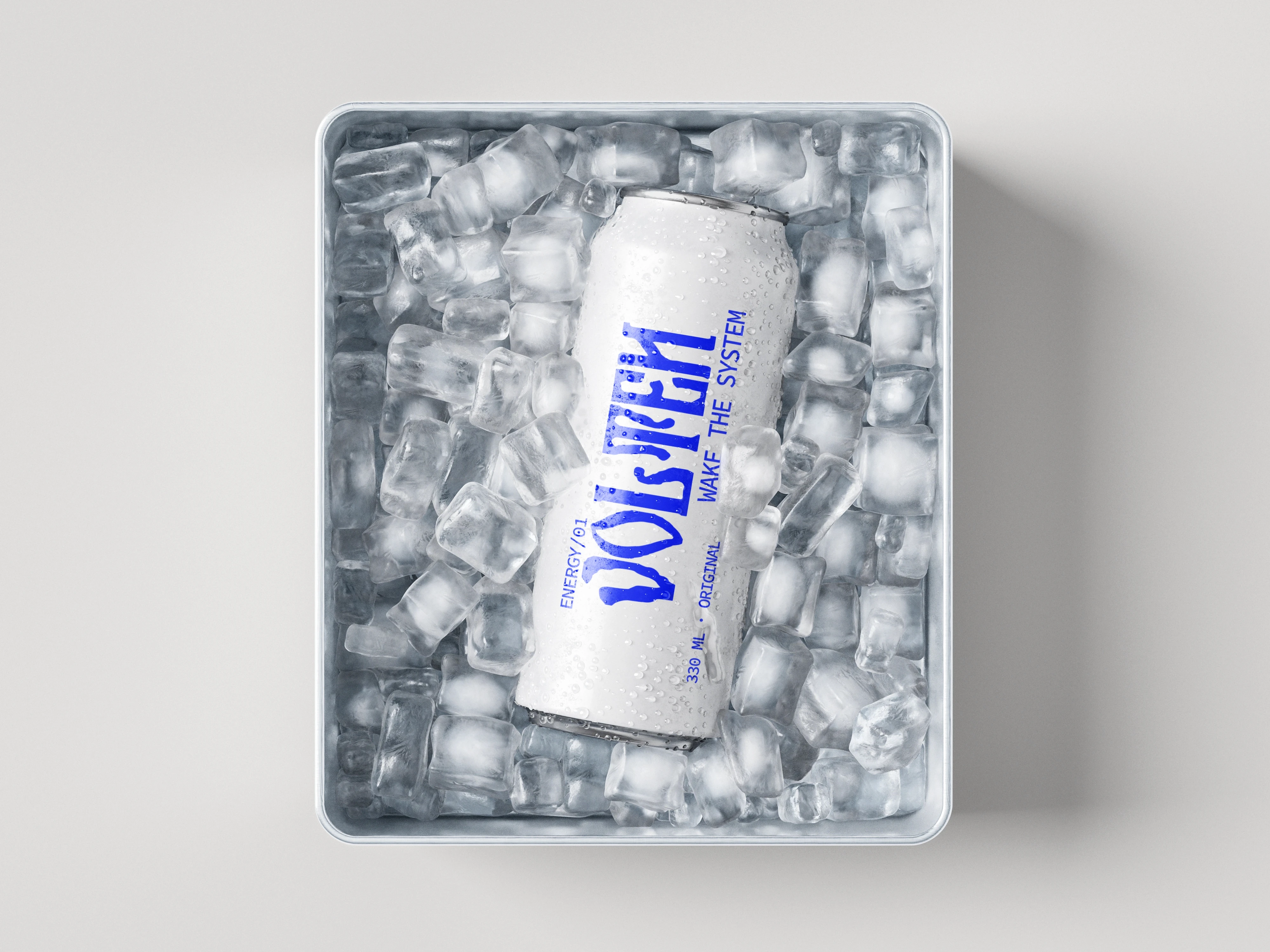
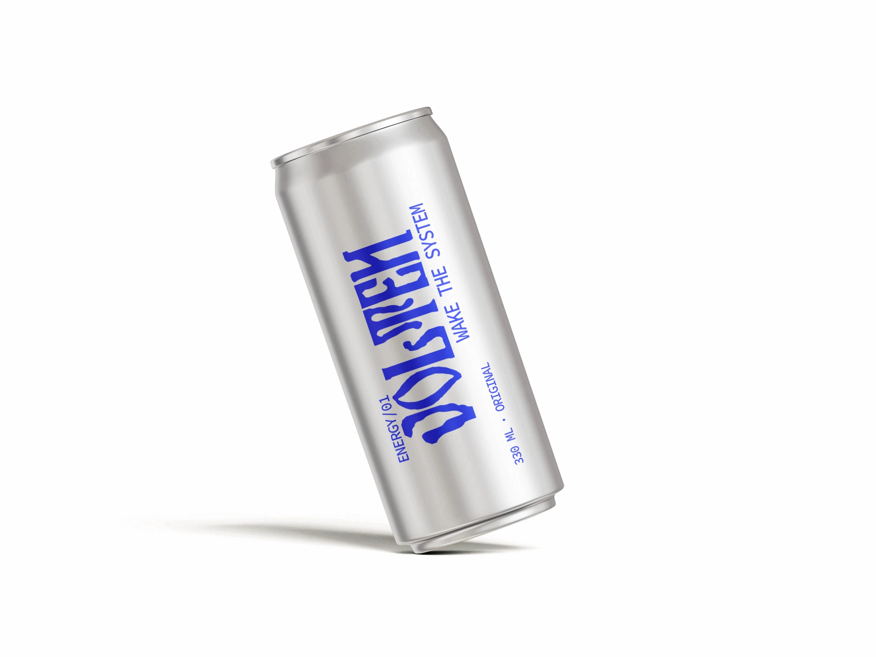
We treated energy as movement rather than decoration. A bold typographic system, sharp graphic forms, and high-contrast compositions became the foundation of the identity.
The visual language was designed to stretch, collide, and shift across different formats — creating a brand that feels in motion even when completely still.
Electric Ultramarine
#3F00FF
Off White
#F7F7F7
Warm Silver
B8B8B8
Sky Blue
#C7E4FF


[The_Outcome]
Volten launched with a visual identity designed to move across shelves, screens, social, and campaign environments. The result is a flexible system that feels energetic by nature rather than simply looking energetic.
Gesso gave Volten an identity that feels impossible to ignore. They found a way to make the brand energetic without falling into the usual energy-drink clichés, and the system works just as well on the can as it does in motion.

Jacob Moran
Brand Director, Volten